Shining On
Originally at http://www.shaunagm.net/blog/2011/01/we-all-shine-on/
This gorgeous graphic has been making its way around the internet lately:
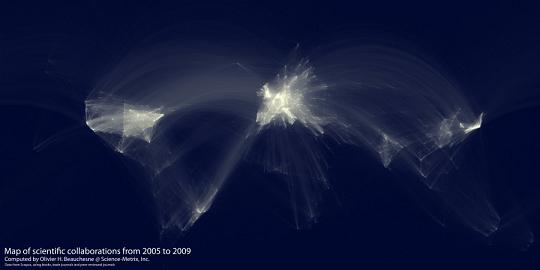
From Flowingdata, which has some larger images and close-ups, along with an explanation of how the graph was made:
“I extracted and aggregated scientific collaboration between cities all over the world. For example, if a UCLA researcher published a paper with a colleague at the University of Tokyo, this would create an instance of collaboration between Los Angeles and Tokyo.” After that, Beauchesne used a similar mapping scheme that Butler used, and behold the results above. The brighter the lines, the more collaborations between a pair of universities.
As pretty as the pictures are, I find them also saddening. Look how faintly South and Central America, Africa, and much of Asia are lit. It’s a visual reminder of the disproportionate influence that certain countries and cultures have on the production of scientific knowledge. I wonder what “scientific consensus” would look like in a world where our developing countries shone like a beacon and the U.S., Europe and Japan were quiet and dark.